![mousemat.png]](https://fundamentals.theretailscore.com/hs-fs/hubfs/mousemat.png?height=40&name=mousemat.png)
Background
At TRS we provide __ different components that can be utilized on all pages. A tile/component is essentially an item on a page, eg a chart or a table would each be a single tile/component.
Below I will provide some detail on all the possible components within the portal:
Header Labels
- A Header Label is a Dynamic String Test. It is commonly used to display the Current Week, Date, and Last Updated Time.
- The Header Label can be bound to any field in the cube and converted to a text string
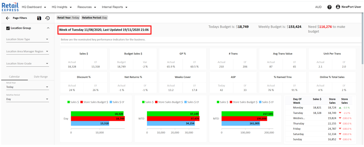
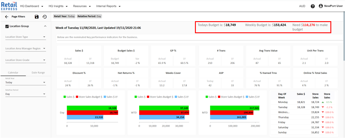
Content Label
- A Content Label is similar to that of the Header Label in that it links to items in the cube and converts them to text.
- It is commonly used to display Budgets/Targets/Forecasts
- Can support conditional formatting, eg change the text to Red if > 0
Rich Text Context
- A Rich Text Context operates similar to that of a Text Box in Microsoft Word
- Within the Rich Text Context, you can add images, videos, text, quick links etc
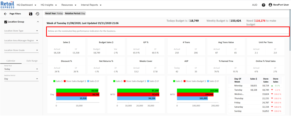
Images Quick Links


Text--Headings Videos
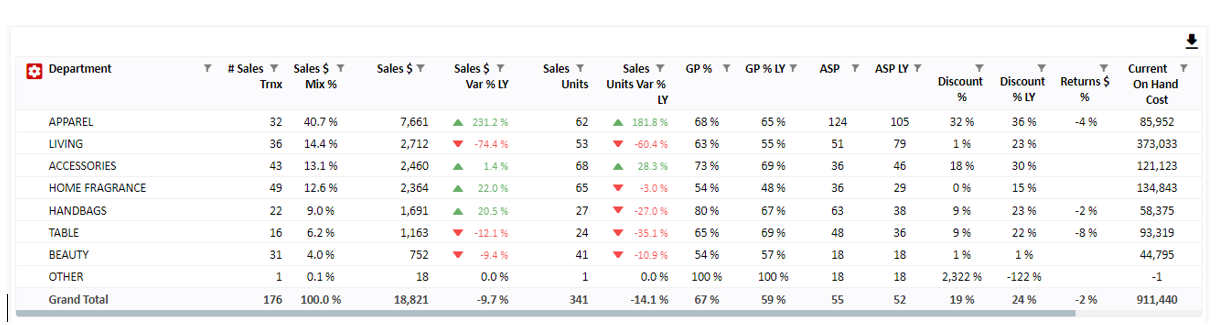
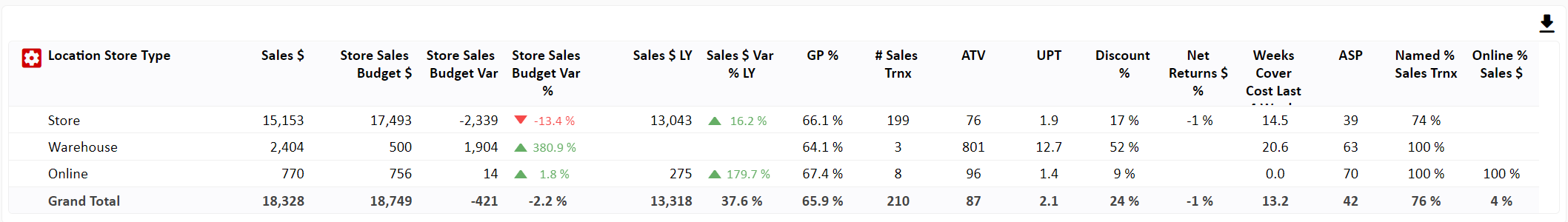
Flex Grids (Fixed Tables)
- A Flex Grid is a static grid that will display data at the lowest level. What we mean by this is that if I add in Product SKU into column 2 below, it would be automatically expanded.
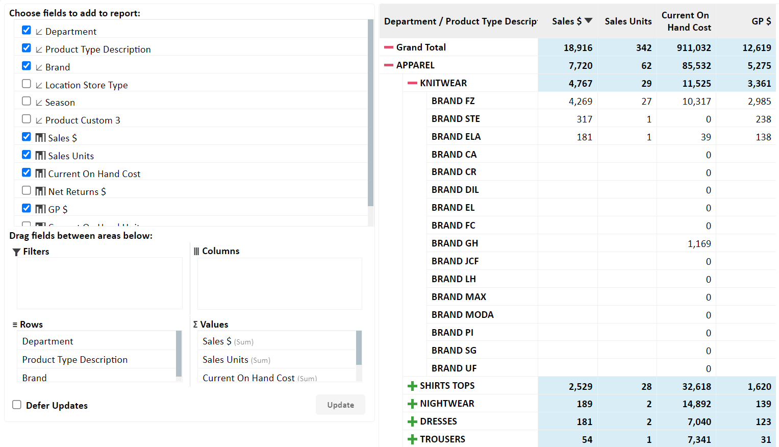
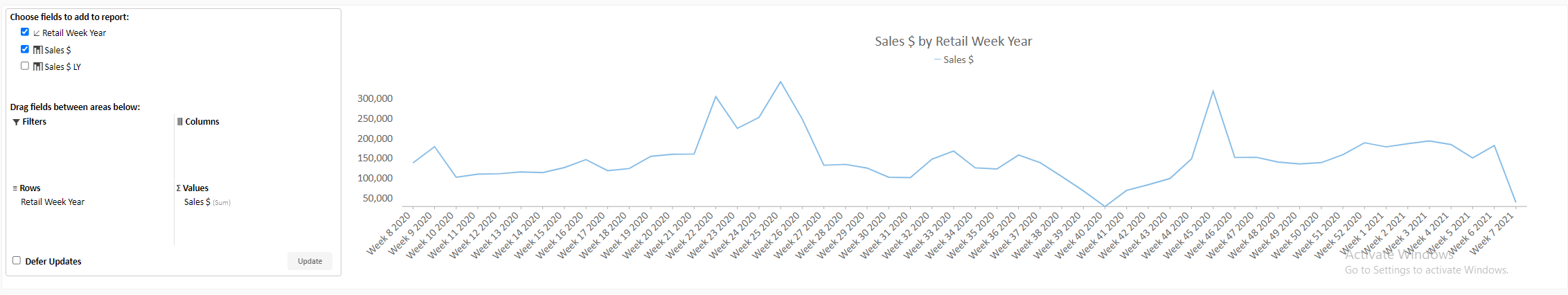
Pivot Grid (Expandable Tables)
- A grid that is closer in functionality to that of Excel's Pivot Grid.
- Supports the ability to Expand/Hide
- Supports Drag and Drop (Build your own report) functionality
Closed Expanded


Pivot Panel - Drag and Drop Functionality
Filters
- A Filter/Slicer/Drop Down is used to put a lens on a certain item or entire page relevant to the selection
- In the Portal, we support different applications of filters
1. We support Page Filters that will put a lens over the entire page. Commonly found in this left-hand panel known as the Page Filter Component
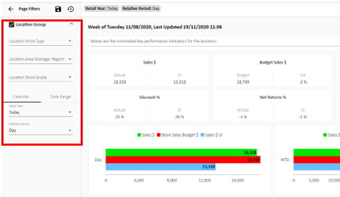
2. We Support Filters/Slicers/Drop Downs that may only apply to one section of a page
3. We can display the Filters as Drop-Downs (Single or Multi-Select) as well as Buttons
Single Select Multi Select Buttons


4. When filtering by calendar we can use slicers/dropdowns above linked to your Retail, Financial or Gregorian Calendar. Additionally, we can utilize a Date Range Selector, allowing a user to select any date, limited by the bounds of the amount of history loaded in the cube.
Closed Expanded


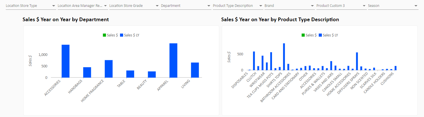
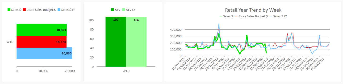
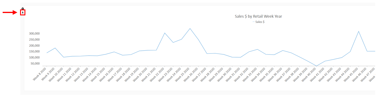
Flex Charts - (Fixed Charts)
- Currently, the three types of charts we offer are Bar, Column and Line Charts
- Colours, measures etc can all be customised as you wish
Pivot Chart
- More flexible than a flex chart
- Can plot row vs column vs measure
- Supports Pivot Panel to Build your own Pivot
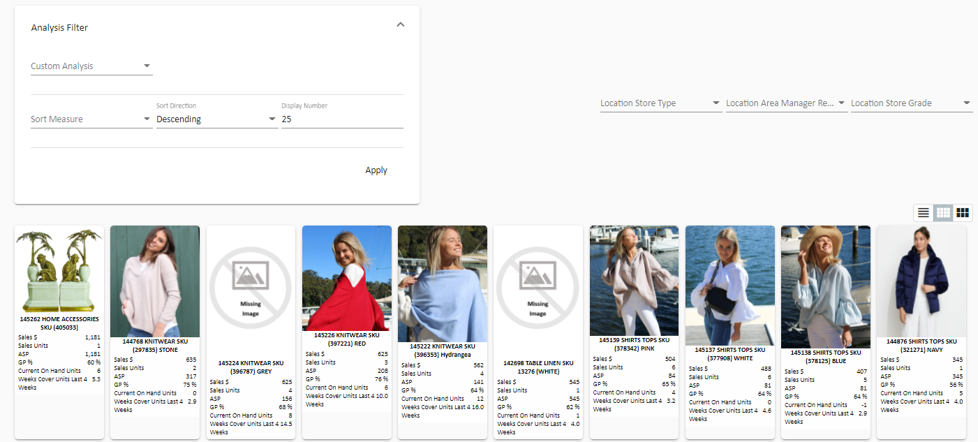
Product Gallery
- The Product Gallery provides a face to your product data. We import your images through different methods and display them in a tile-based format below.
- The analysis filter allows the ability to provide custom sorts
- The 3 Button Icon to the right, allows you to change between a Grid View, Image View and Card View
Image View
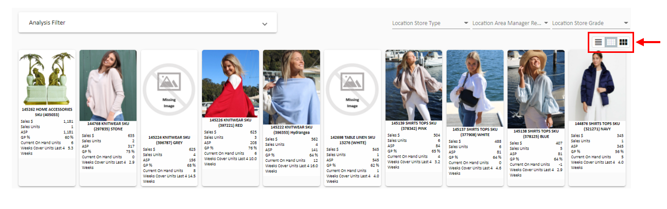
Grid View

Card View

Image View (Analysis Filter Expanded)
Resource Library - Automated Reports & Static Reports
- In the Portal, we can upload files onto the page (a folder of sorts)
- The two types we accommodate are Documents and Reports
- A Document is just a flat-file (could be a handbook document for example)
- A Report is an automated file (is refreshed at a set time, in our backend, and published on the portal)


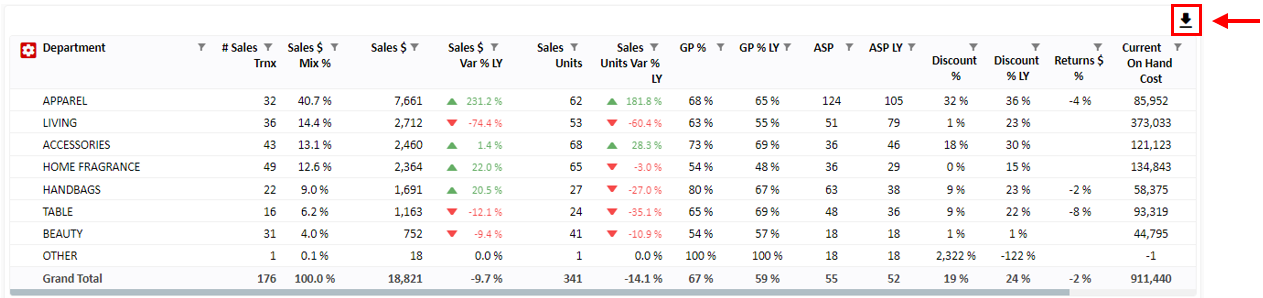
Export Buttons
- On Grids we can Export to Excel
- On the Pivot Chart, we can Export to a JPEG
- Using a 'Generate PDF' button we can export whatever is below the button to a PDF
- The limitations at the moment are that the Button does not capture charts and rich text context
- We advise users who want to export Galleries, Images, etc to PDF to use 'Ctrl + P'
- We can combine the Generate PDF with a 'Comment Box' to enable users to add comments before exporting to PDF
Note: If I clicked the button Generate PDF, it would export the grid below and any comments in the comment box to a PDF document.